When I first heard about Fleekus, it was just an idea — but a powerful one. This was right before the term 'fake news' really hit the mainstream. The platform had a simple concept of setting the information free, allowing people to break news, being it actually news or some other topic they were passionate about. Imagine a polygamic marriage between blogs, magazines, newspapers, and all other forms of visual and written media, published by the people, without editors or big corporations to censor content they didn't agree with. Fleekus was also the first platform to bring community content checking to life. That really hit the spot — Fleekus engaged over 114 million users and reached 251 million pageviews in its first 24 months of being released just in the U.S. and Brazil.

Materializing the idea
How did it start? The shareholders came to me with the concept of what Fleekus should be, and my first task was to elaborate the very first wireframe of a platform that would turn that idea into something people could actually use. It was challenging, but I’ve got to say — that’s right in my ballpark. Turning ideas into real products is what excites me the most. But first things first, we needed a logo and a full branding study to establish a solid identity we could rely on when designing the first screens.
Branding
When it came to designing the logo, I knew we needed something simple, memorable, and directly tied to the idea of communication. One of the concepts I presented was a dialogue balloon — a clean, universal symbol that instantly connects with the idea of sharing and conversation. It made the reference crystal clear without overcomplicating things. Not surprisingly, it was the favorite and ended up being the chosen direction. To give the brand even more personality, I created a custom font that felt modern but still friendly, and introduced a signature shade of purple to make it stand out. The color helped create a strong, recognizable identity right from the start.


UX + UI
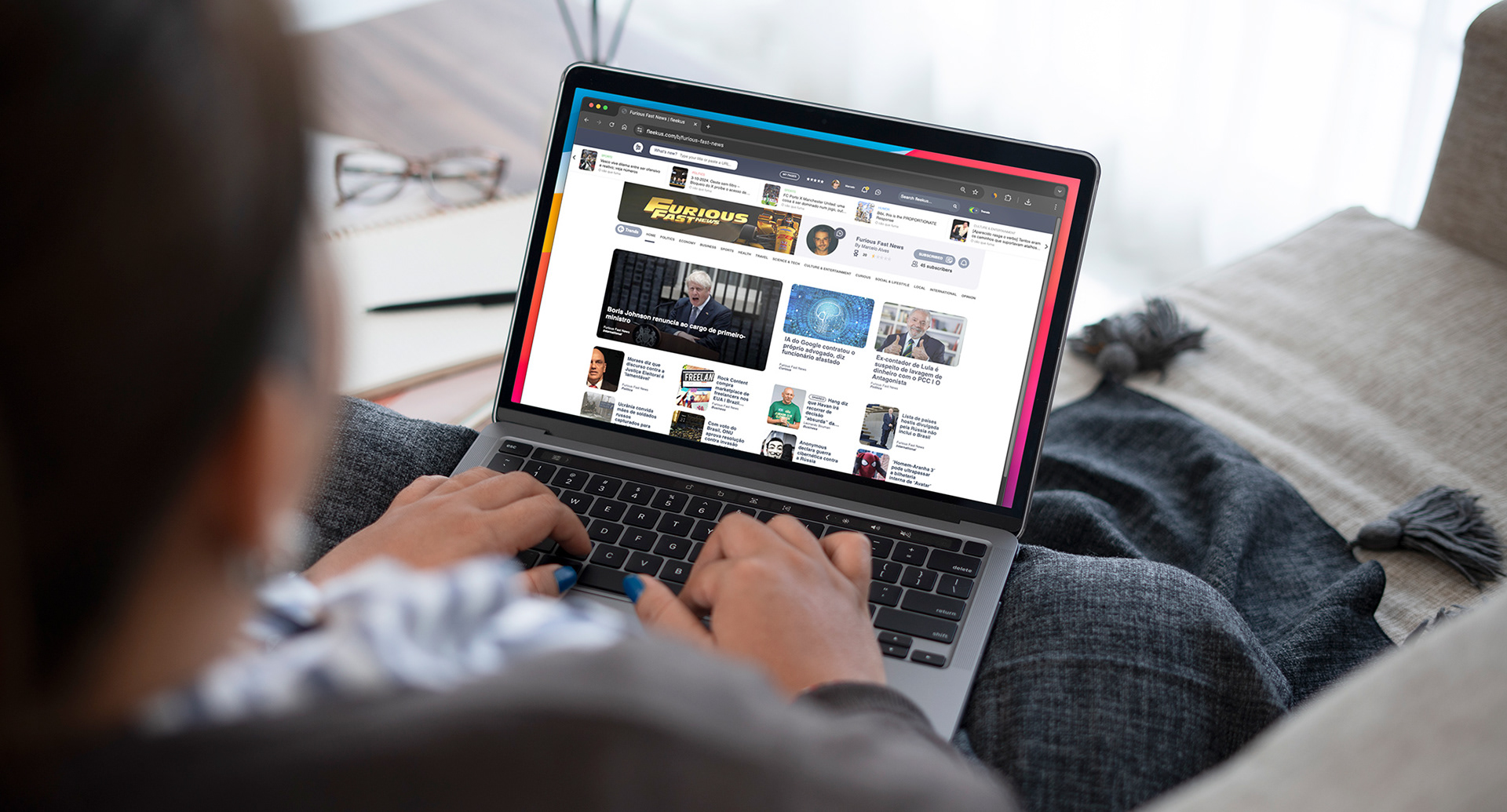
The first wireframes for this project were a challenge in themselves. The idea behind the app sounded simple at first: create an experience so easy to navigate that users could find what they needed in just two clicks — no more, no less. But there was a catch: we also had to keep the screens clean and uncluttered, without overwhelming users or making even the least OCD-prone among them feel uneasy. Publishing an article needed to feel just as effortless as reading one. Unlike so many content apps and websites, where you blink and the article you were reading is suddenly gone for good, we wanted users to move smoothly between different pieces of content and easily pick up right where they left off, whenever they wanted. It wasn’t easy, but it was exactly the kind of challenge I love. Challenge accepted, and solution delivered, both for the web platform and the native app.


Mograph Videos
During the development of the project, I also had the chance to expand my role and create social media content to help bring the platform’s voice to life. This included producing some topic-specific motion graphics videos, as well as daily ‘Today on Fleekus’ short clips that highlighted trending stories and new posts. It was a great opportunity to not just build the product, but also help shape how it connected with its audience day to day, making Fleekus feel active, relevant, and part of users’ everyday conversations.
Fleekus launched to immediate success, quickly gaining traction with users who embraced the platform’s promise of true freedom of expression. As Fleekus grew, so did the pressure, and it became a target exactly because of its commitment to freedom of speech.
It was a powerful reminder that building a platform for open voices comes with real-world challenges, and that the bigger the impact, the stronger the resistance.